I walked out of good ol' Target with this 'value pack'. I even saved a buck thanks to the coupon found in the Marketside pizza packs. Since I had no expectations going in, I hoped to avoid disappointment. Here's a look at the best base card I pulled(really the only one worth showing off).
I still don't love the design, but it continues to move in the right direction for me. The look is even cleaner and less cluttered than last year, but still has some useless, extraneous design elements book ending the 'Gypsy Queen' text. It's still nice to pull one of the best RCs available in the product. Year after year, I tend to enjoy the inserts in GQ more than the base cards. I pulled one insert from the three packs.
Power Alley seems like a decent enough set. I like he crossed bats with the career HR total in a baseball in front of them. That being said, I find the decorative, blue design to be superfluous. Hey, I can be unnecessarily showy too! That's all for the post worthy standard size cards since I didn't pull any variations or SPs. I was fortunate that 2 out of 3 of the minis were pretty decent.
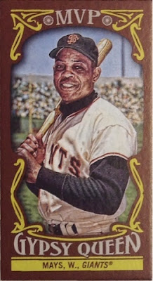
First up, an MVP insert of Willie Mays! The more I look at the insert designs, the more I feel like my 6 year old daughter just scribbled some random lines around the pictures. At least it's a new card of one of the greatest players of all time.
This Sparky Anderson is probably the best card of the 'value pack'. It's a green mini parallel. What does that mean? Well, let's take a look at the flip side.
It's pretty tough to read, but that serial number is 38/99. Granted, it's nothing Earth shattering, but still it was the best card of the bunch. Now, my favorite card(s) of the bunch came from the exclusive framed parallel pack.
I really like the way these blue parallels look. Similar to previous years, the blue frame is raised like the photo was matted. I was pleasantly surprised to find the look of these so much to my liking and was equally surprised to find two cards that actually fit into my collection. The Robbie Cano and the Greg Bird are staying put, but I could be pursuaded to trade any of the others if there's any interest. Thanks for reading.


I liked last year's design a lot but this year's will probably grow on me. Those are some nice pulls.
ReplyDeleteStill not a GQ fan, but that Killebrew is nifty.
ReplyDeleteGQ is ugly every year, but I'm interested in the blue Montas ... for reasons.
ReplyDeleteI'll send it your way.
DeleteI love that Sparky card. I'm such a sucker for manager cards.
ReplyDelete